When serving images from S3 stopped being good enough
By Allen Helton07 January 2026
Listen to me read this!
I published my first blog post 7 years ago. I wrote on Medium for about a year before I built Ready, Set, Cloud. For most of its life, the site hasn’t had much of a facelift or performance updates. It’s primarily served as a home for my writing, newsletter, and podcast.
I’ve been running this site for six years. I’m usually the kind of person who can’t leave things alone for long, yet this has been largely unchanged for years. It worked. Until it didn’t.
When I finally took a look at site performance, something was painfully obvious. Images. PageSpeed Insights showed that large, unoptimized images were dominating load time. Single file sizes served directly from S3, no format negotiation, and no caching were starting to add up.
That setup wasn’t wrong when I built it. It was a perfectly reasonable tradeoff at the time. It was simple, low maintenance, and honestly, good enough. The site had a couple dozen readers, and small-scale simplicity won. But as the site grew, both in content and audience, performance expectations changed. Serving raw images straight from S3 no longer cut it. The site outgrew its initial build.
What I needed from image delivery
The knee-jerk reaction is to jump into S3 and manually optimize a bunch of images. That fixes a symptom, but it doesn’t solve the underlying problem. I needed to step back and rethink what image delivery should look like for a content-heavy site serving tens of thousands of monthly visitors.
Manually resizing images, converting them to web-friendly formats, and deciding which size to upload per post was never going to scale. More importantly, I didn’t want to change my workflow. I wanted to continue to write, publish, and move on without adding in layers of performance checking.
A good system should make that possible. It should optimize images automatically in the background. It should serve modern formats like WebP when the browser supports them. It should provide multiple image sizes so mobile devices aren’t downloading desktop-sized assets. And it should be aggressively cacheable, because image delivery is a solved problem, and CDNs already do this exceptionally well.
Thinking about these requirements, I realized I wasn’t really looking to build a new image optimization tool (like I would have done in the past). Instead, I was updating the site’s image handling capabilities so these decisions were made once, centrally, in an industry-standard way.
Fitting a CDN into the workflow
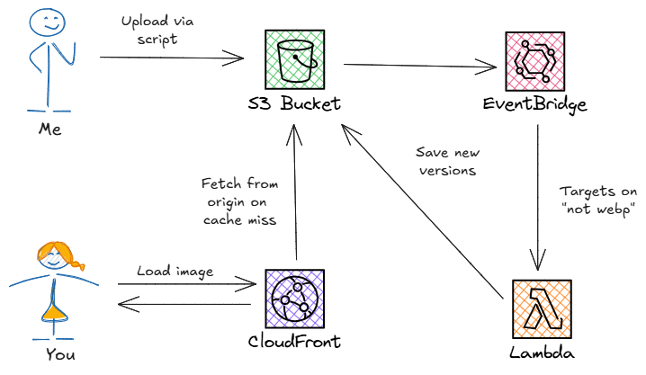
I upload images to Ready, Set, Cloud using a small JavaScript script that lives in the repo. It takes a file prefix, scans a local folder for matching files, and uploads them directly to S3. There’s no web UI and no automation that tries to interpret content. It’s simple by design, and I wanted to keep it that way.
That simplicity turns out to be a feature. Because images already flow through S3, the system can react to uploads without changing the workflow at all.
Image uploads automatically trigger a Rust Lambda function (through EventBridge) that converts the original image to WebP and generates a handful of standard sizes. Those optimized versions are written back to S3 alongside the original.
This does a few important things. First, it makes image optimization deterministic - meaning every image goes through the same process every time. Second, it keeps work off the critical path. All of this happens asynchronously and doesn’t interfere with the rest of the publishing workflow like cross-posting, writing analytics, or scheduling.
Finally, I added a CloudFront distribution in front of the S3 bucket. That keeps delivery fast and predictable by serving cached assets from points of presence around the world. Because it points at the existing bucket, there’s no data migration involved. Image delivery improves without changing where anything lives.
Serving the right format without changing URLs
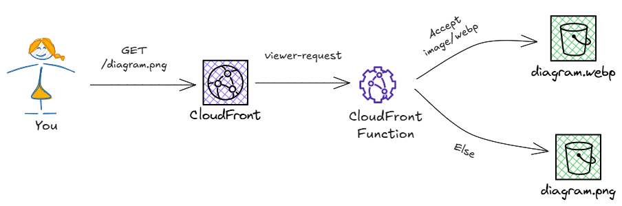
Once image processing was handled, delivery became the next concern. All optimized assets were already in S3, but I wasn’t interested in changing 2,000+ image links across existing content just to take advantage of them.
The answer was to push that behavior into the CDN. By updating the distribution to look for WebP support in the Accept header, requests for images could be routed to the optimized versions without changing a single URL. Modern browsers already advertise their supported formats, so content negotiation becomes a routing concern rather than a frontend one.
A CloudFront function runs on the viewer request event and rewrites the request path whenever the browser advertises WebP support. It doesn’t check whether the WebP file exists - that’s resolved later when CloudFront fetches from the origin (the S3 bucket). The important part is that the rewrite happens consistently at the edge, and the resulting response is cached, so subsequent requests follow the same path.
Letting the browser choose the right size
Using WebP was only one part of the solution. Once multiple sizes of every image existed automatically, the next question was which one to serve. Mobile screens don’t need desktop-sized images, and high-DPI displays can benefit from larger ones. Not to mention saving on load times for thumbnails on the home page.
Using srcset allows the browser to make that choice on its own. The markup stays the same, there’s no runtime logic, and each client downloads only what it actually needs. The responsibility for choosing the right size moves to the client, where that decision can be made with full context.
Ready, Set, Cloud is a static site generated by Hugo. In my case, adding srcset support meant overriding the render-image hook and adding a small amount of logic to create the additional attribute.
Performance improvements and an unexpected bonus
My primary goal with all this was to decrease load times so my site felt snappy without adding anything to my existing workflow. With the image optimization component plus the CDN for cached delivery (and the client-side srcset addition), I’m pleased to say page payloads dropped significantly. Pages render faster, Largest Contentful Paint (LCP) improved, and overall performance is more predictable.
On my homepage, the First Contentful Paint (FCP) dropped from 4.5 seconds to under a second. Load times are much more consistent across desktop and mobile as well, which has been an ongoing challenge.
The unexpected bonus was that these same changes also helped with search engine rankings. Faster pages, smaller downloads, and aggressively cached assets all feed into Core Web Vitals. So without targeting SEO explicitly, the site became easier to crawl, faster to index, and rank higher in search results simply by prioritizing user experience.
Making this easy to reuse
If you’ve built your own blog, you’ve probably run into these performance bottlenecks just like I have, and that’s okay. Serving assets out of S3 is a valid solution and has worked well for me for six years as the site grew.
When my constraints changed, I wanted to extend the system without changing the deployment workflow. If you’re interested in the same improvements I’ve described here, this setup is available in the Serverless Application Repository as a drop-in addition to an existing system. The full source is also available in GitHub if you want to dig into the details or adapt it further.
Above all else, this was about taking an entire class of decisions around image formats, sizes, and caching, and keeping them out of the day-to-day workflow. With everything in place, performance simply happens by default.
This was as fun as it was important for Ready, Set, Cloud. I wanted something easy to adopt, easy to remove, and something that quietly does the right thing as everything else moves around it.
Allen is an AWS Serverless Hero passionate about educating others about the cloud, serverless, and APIs. He is the host of the Ready, Set, Cloud podcast and creator of this website. More about Allen.


 Share on: